I know I seem to have gotten into an art rut, but I can’t help but want to share all of my favourites with you guys. Today, I’m bringing you Paul Klee, a Swiss painter influential in the works of expressionism, cubism, and surrealism. He lived until 1940 and helped to draft and perfect colour theory, or, more colloquially, the ways in which we match colours to be aesthetic.

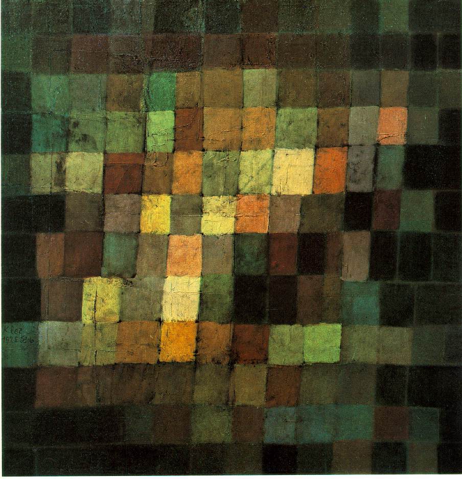
Let’s peer into Klee’s world, shall we? Let me tell you, it’s a dark world. Much of his work is unnerving at best and disturbing at worst. I’ll open by focusing on his interest in colour theory, as depicted in the image above. The subtle use of rich warm tones and stark cold tones gives the piece a distinctly balanced quality. Yet it doesn’t feel polarised, despite the great difference between the rich black and poignant bright tones. Instead, it feels illuminated.
If you peer into the shadowed areas, such as in the lower right quadrant, there are warm squares that balance against the cool adjascent to them. Also, the combination of the geometric to the organic, hand-drawn feel allows movement in the painting that would otherwise be nonexistent.
 What I adore about the piece to the right is not only its balance of colour but also of composition. It certainly feels left-heavy, but it is also grounded what with that thick, bold red stripe on the floor of the painting. This gives it a strong base from which the more complex geometry of the left can grow. Also, the left side does not contain an upsetting amount of contrast; the simple red blocks are the only extreme statement in the piece.
But Klee didn’t only work in squares, however. He could appreciate more than the stark geometric; some of his best works include the organic. Of course, because they are his best, they are also his most horrifying.
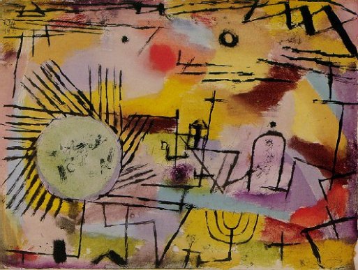
Take Rising Sun for example (shown above). It contains plenty of organic shapes, such as eerie curves and clearly human-drawn circles. Even the geometric has a distinctly sketchy quality to it. But this is also what makes it deeply unnerving. The sickly combinations of colours hark Kandinsky, while the schitzophrenic black marks seem like a fragmented Motherwell. There is something upsetting about this painting, perhaps because it looks — feels like chaos.
Klee was isolated for much of his artistic career, preferring to work alone rather than in the company of his fellow artists.

He also had a consuming disease, which led to much suffering near his death. This piece, one of his last, is called Death and Fire. The “tod,” German for “death,” can be seen on the skull’s face. Starkly different from the careful, calculated colour swatches of his earlier work, there is something unnatural, burning, Hell-like, and tortured about this painting. The stark lines give us a severed feeling. The softness of them tell us how it must feel to burn to death from illness.
-A.
Photographs Courtesy of: